Marina Lubimova

Oil's latest move higher has reignited debate over how far prices can realistically extend - but a longer-term adjusted view suggests the ceiling may be far higher than commonly assumed. As Value Seeker highlights, historical oil peaks - when normalized for money supply - sit significantly above today's levels, reframing expectations for the commodity's long-term range.
A Different Lens on Oil's Historical Peaks
The chart presents oil prices adjusted for money supply, allowing comparisons across decades on equal footing. Instead of relying on nominal highs, this approach recalibrates past peaks into today's dollar terms.
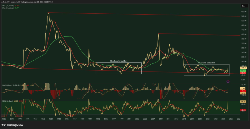
Two reference levels stand out clearly:
- 1980 peak adjusted to approximately $560
- 2008 peak adjusted to around $385
Both levels are substantially higher than current prices, suggesting that what is often perceived as expensive today may still fall well short of historical extremes when viewed through this adjusted framework.
Oil Cycles That Repeat, But Not Equally
The long-term structure shows pronounced boom-and-bust cycles, with sharp spikes followed by extended normalization phases. The late-1970s surge stands as the most extreme move on the chart, followed by a multi-year decline and eventual recovery into the 2008 cycle.
More recent price action appears far less extreme by comparison. The current range sits well below the upper boundary defined by prior adjusted peaks, indicating that the market is not yet operating at historical extremes.
This reinforces the central idea: commonly cited reference points like the $150 level may significantly underestimate the true range suggested by past cycles.
Why the $150 Oil Narrative May Be Misleading
Market discussions often frame $150 as a worst-case upside scenario, largely because it aligns with the nominal 2008 peak. The adjusted perspective challenges that assumption directly.
By accounting for changes in money supply, the chart suggests a meaningfully different picture:
- Historical peaks extend far beyond $150 in today's terms
- Current price levels remain well below those adjusted extremes
- The perceived ceiling may be anchored to nominal rather than real values
The perceived ceiling may be anchored to nominal rather than real values - a framework that flatters current prices far more than historical context supports.
At the same time, this analysis is framed as a matter of probability and positioning rather than prediction. Recent inventory data adds another layer to the backdrop - WTI Oil Inventories Jump 6.9M Barrels to Highest Level Since June 2024 shows that supply-side dynamics are still very much in play, complicating any straightforward bullish read.
Positioning in a Wider Range of Oil Price Outcomes
The key takeaway from the chart is not a specific price target - it is a shift in perspective. When historical context is adjusted for money supply, the range of possible outcomes expands significantly.
Rather than focusing on a fixed ceiling, the framework suggests thinking in terms of asymmetry: potential upside may be larger than commonly assumed, while downside risk remains more contained by comparison.
 Marina Lubimova